Custom slider thumb
Every slider takes a thumb slot, so the Material 3 thumb can be replaced outright — its
size, shape and stroke are yours rather than a fixed set of dimension parameters. The slot
reads the slider's InteractionSource, position and thumb color from its scope, so a thumb can
also react to press and drag.
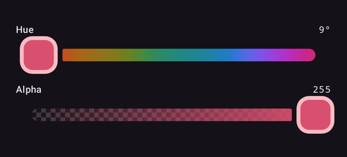
private val SquareThumbSize = 48.dp   // M3 minimum interactive size

@Composable
fun SquareThumb(color: Color, interaction: InteractionSource) {
    val fill = color.copy(alpha = 1f)
    val shape = RoundedCornerShape(16.dp)
    val ring = lerp(fill, Color.White, 0.6f)

    val dragged by interaction.collectIsDraggedAsState()
    val pressed by interaction.collectIsPressedAsState()
    val elevation by animateDpAsState(if (dragged || pressed) 4.dp else 0.dp)

    Box(
        Modifier
            .size(SquareThumbSize)
            .shadow(elevation, shape)
            .background(ring, shape)
            .padding(5.dp)
            .background(fill, RoundedCornerShape(11.dp))
    )
}

ChannelSlider(
    state = state,
    channel = Okhsl.H,
    thumb = { SquareThumb(state.color, interactionSource) },
    // so the track leaves room for it
    dimensions = ColorPickerDefaults.currentDimensions().copy(thumbWidth = SquareThumbSize),
)
The thumb needs no state parameter: state is already in scope at the call site, so the
composable restyles itself as the color changes. The ring is the fill lifted toward white
rather than a light-or-dark choice made at some luminance threshold — a threshold snaps
visibly the moment a drag crosses it, while this moves with the color. And because the
slot reads the slider's InteractionSource, the thumb can react to being dragged;
that is state a caller cannot otherwise reach, since the source is created inside the
slider.
Thumb width
thumbWidth matters. The track breaks around the thumb, and it sizes that break from this
value, ColorPickerDefaults.ThumbWidth (the Material 3 handle) by default. A wider thumb
that does not declare its width covers the gap and sits flush against the gradient.
thumbTrackGap controls the clearance itself. Copying currentDimensions() changes the one
size and keeps whatever an enclosing ColorPickerTheme set for the rest. The sample app's
Custom thumb section runs exactly this code: see Running the samples.
A thumb given to a picker reaches every slider in it that has none of its own: see
Color pickers.