Theming
Every slider, plane and picker accepts colors, shapes and dimensions built with
ColorPickerDefaults, and ColorSwatch its colors and a shape; the colors and shapes derive
from MaterialTheme by default:
ColorPicker(
    state = state,
    colors = ColorPickerDefaults.colors(
        checkerboardLight = Color.White,
        checkerboardDark = Color.LightGray,
    ),
    shapes = ColorPickerDefaults.shapes(
        trackShape = RoundedCornerShape(4.dp),
        swatchShape = RoundedCornerShape(8.dp),
    ),
)
ColorPickerTheme
ColorPickerTheme sets them for everything inside it instead, which is how a track height
reaches every slider without being a parameter on any of them:
ColorPickerTheme(
    dimensions = ColorPickerDefaults.dimensions(trackHeight = 24.dp),
) {
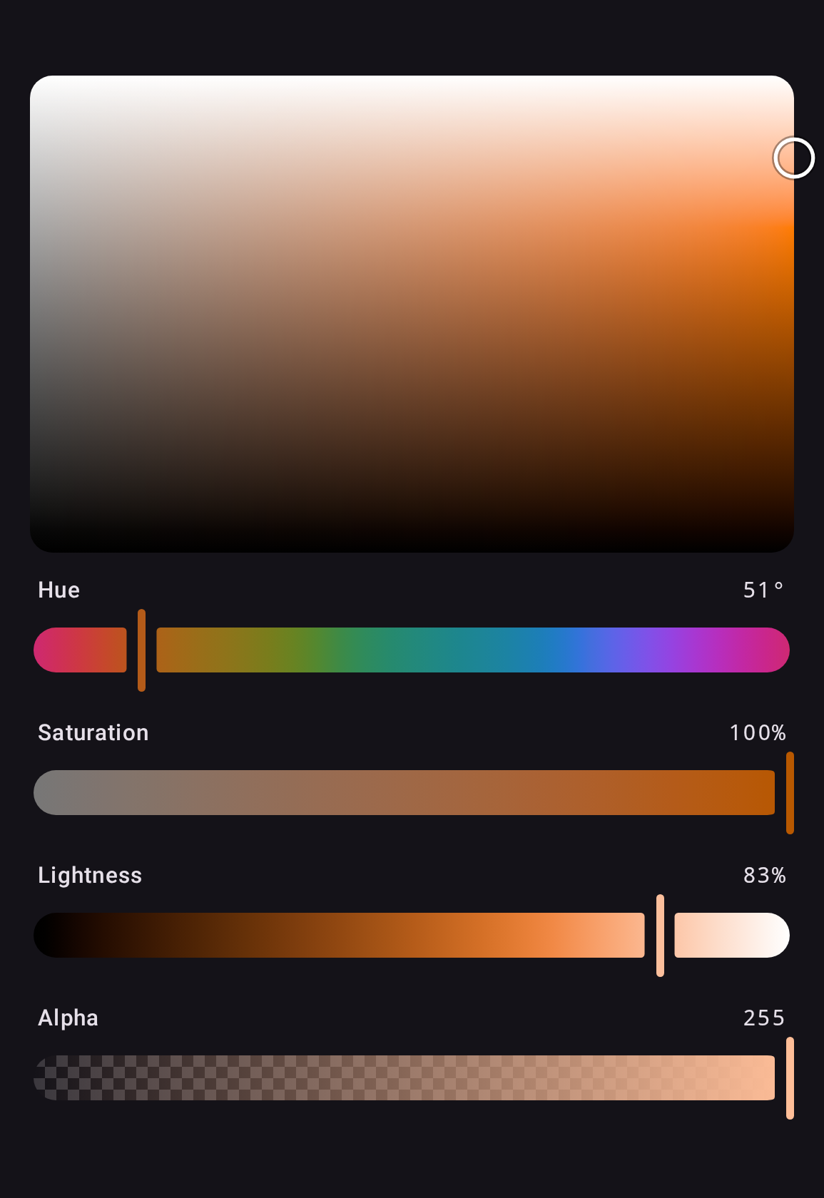
    ColorPicker(state)
    ChannelPlane(state, Okhsl.S, Okhsl.L)
}
A component reads the theme in its parameter defaults, so an explicit argument still wins over
whatever an enclosing ColorPickerTheme provided. What a ColorPickerTheme is not given it
leaves to the theme around it, so a MaterialTheme nested inside still colors the pickers under it.
ColorPickerDefaults.colors(), shapes() and dimensions() keep every value you leave out, and
each class's copy does the same from one you already have, such as
ColorPickerDefaults.currentColors().
For a design system other than Material, see Without Material.