Without Material
codes.side:colorpicker-foundation holds the same components with no look of their own. Each draws
what its slots draw, and a slot reads what it needs from a scope: a slider's position, its color and
whether it is enabled, a plane's position, a channel slider's gradient. Dragging, the keyboard, a
screen reader and the picker's disabled state work as they do in the Material components, which are
built on these. Setup shows what each artifact holds.
| Material 3 | Foundation |
|---|---|
ColorPicker |
BasicColorPicker |
ChannelSlider |
BasicChannelSlider |
AlphaSlider |
BasicAlphaSlider |
ColorSlider |
BasicColorSlider |
ChannelPlane |
BasicChannelPlane |
ColorPlane |
BasicColorPlane |
ColorSwatch |
a clip, Modifier.checkerboard and a background |
ColorComparison |
BasicColorComparison |
ColorPickerDialog |
BasicColorPickerDialogContent over a ColorPickerDialogState, in a window of your own |
A picker without Material
BasicColorPicker hands each slot a part, the state and the channel or the plane's axes, and a
library slider or plane in a slot takes the picker's coloringMode and reports to its
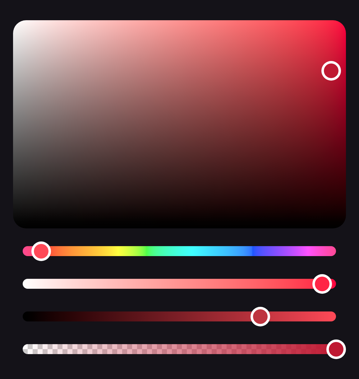
onValueChangeFinished without being told. A picker with round thumbs and pill tracks, and nothing
from Material:
BasicColorPicker(
    state = state,
    space = Okhsv,
    plane = { part ->
        BasicChannelPlane(
            part.state, part.x, part.y,
            Modifier.fillMaxWidth().aspectRatio(1.6f),
            shape = RoundedCornerShape(16.dp),
            thumb = { RoundThumb(thumbColor) },
        )
    },
    channelSlider = { part ->
        BasicChannelSlider(
            part.state, part.channel, Modifier.fillMaxWidth(),
            track = { Box(Modifier.fillMaxWidth().height(12.dp).clip(CircleShape).background(gradient)) },
            thumb = { RoundThumb(thumbColor) },
        )
    },
    alphaSlider = { part ->
        BasicAlphaSlider(
            part.state, Modifier.fillMaxWidth(),
            track = {
                Box(
                    Modifier.fillMaxWidth().height(12.dp).clip(CircleShape)
                        .checkerboard(Color.White, Color.LightGray)
                        .background(gradient),
                )
            },
            thumb = { RoundThumb(thumbColor) },
        )
    },
    spacing = 16.dp,
)

@Composable
fun RoundThumb(color: Color) {
    Box(Modifier.size(24.dp).background(Color.White, CircleShape).padding(3.dp).background(color, CircleShape))
}
The disabled state
A slot reads from its scope whether it is enabled. What lies outside every scope reads
LocalColorPickerEnabled to look disabled with the picker: a label drawn above a slider, or the field
a BasicChannelPlane paints, which it leaves undimmed when disabled. The sample app's Built on
foundation section runs a picker like this one, its plane dimmed through its modifier.